前回はこちら
もくじ
ボックスレイアウトについて
STUDIOは積み木みたいに積み上げていく「ボックスレイアウト」。
コーディングと同じでheader、main、sidebar、footerみたいに要素を重ねて作り上げていく感じ。
無尽蔵に要素を配置していくデザインじゃないからレスポンシブ化しやすい。
Office製品でいうと×パワーポイント 〇自由度の高いWordというイメージ。
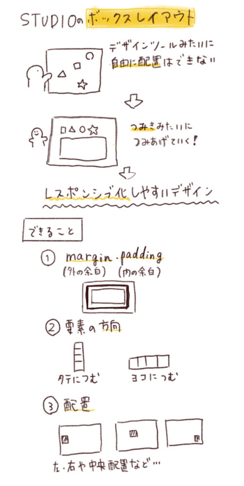
要素の追加
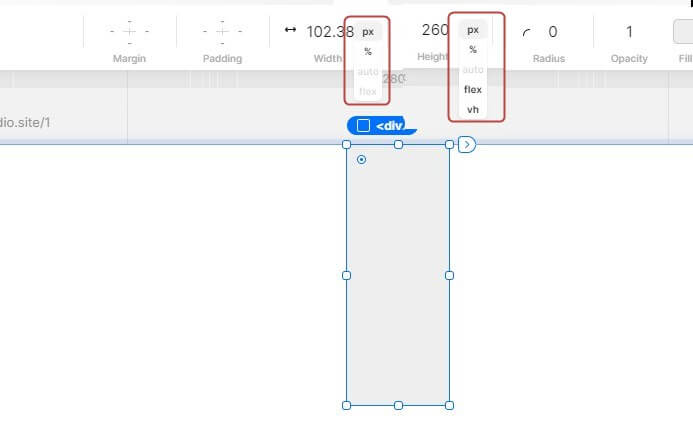
要素はpx、%、auto、flex、が指定可能。縦幅はvhもある。
要素内にさらに要素をドラッグ&ドロップして配置できる
入れ子親子構造にできる。
<div>
  <div></div>
  <div></div>
  ...
</div>
みたいな感じ。
flexの概念
ボックス内に要素があったり要素をグループ化している場合は矢印アイコンが出現して、それがflexの考え方に沿って配置できる。
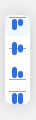
flex-direction
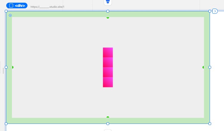
これはflex-direction:column;の状態。
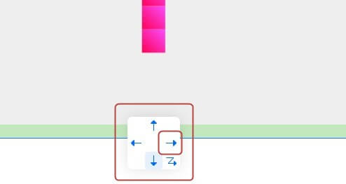
こんな感じでflexの状態を選択できる!
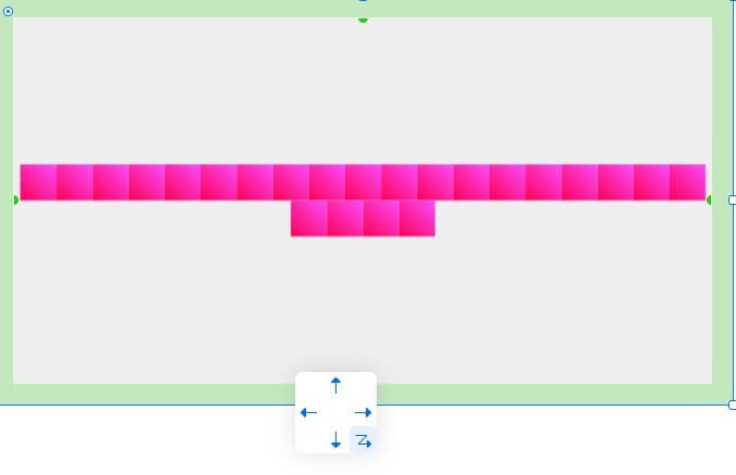
ギザギザの矢印を押すとflex-wrap:wrap;と同じ効果。
| STUDIOボタン | CSSプロパティ |
|---|---|
 | flex-direction: column-reverse; |
 | flex-direction: column; |
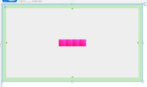
 | flex-direction: row; |
 | flex-direction: row-reverse; |
 | flex-direction: row;flex-wrap:wrap; |
align-items・justify-content
左/上のアイコンを選択するとalign-items・justify-contentの指定ができる。
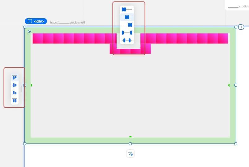
| STUDIOボタン | CSSプロパティ |
|---|---|
 | 上から順に ・ align-items: flex-start;・ align-items: center;・ align-items: flex-end;・ align-items: stretch;?(align-content: space-between;かも?) |
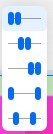 | 上から順に ・ justify-content: flex-start;・ justify-content: center;・ justify-content: flex-end;・ justify-content: space-between;・ justify-content: space-around;orjustify-content: space-evenly;? |
 めちゃくちゃコーディングの考え方にに沿ってデザインできるんだなあ、、すごい